Hot on the heels of my Cardiff Giant book, I was commissioned to illustrate a second book in the JEM series, this one titled "UFOs Teen Sightings." Unlike the previous title which was one continuous tale of trickery, this book featured 11 separate stories, all with themes involving UFOs or alien encounters of one kind or another. The tales span centuries and several countries, ranging across the USA from Massachusetts, Kentucky, Georgia and California to Spain, Germany, Italy, and South Africa, among other locales. In each case, young people were featured players, either as witnesses, abductees, or in some cases, possible aliens themselves.
I chose a different medium, or mix thereof for this book. Switching from my acrylic/pencil/ink technique of the Cardiff Giant tome to watercolor and gouache with Prisma pencil and ink on a textured gray paper. I wanted to try working from the middle tones out, i.e., drawing on the gray paper, adding darks and shadows with watercolor and highlights with the gouache and Prisma pencil. I added detail with Rapidograph pen when necessary.

Hey, if you've got a giant fireball in your collection, why not lead
with it!? There's nothing I don't love about this illustration. The
texture of the paper stock I used showing through in the sky and the
front side of the train station, the impasto texture of the fireball
(heavy on the white gouache), the chiaroscuro effects on the two figures
and the station, all those little blades of grass... It just makes me
happy to look at. The image is from the Italian story wherein two boys
see a fireball near the railroad station in a small town. Ultimately,
the fireball turns into a weird creature that follows the boys until
they finally evade it.
In the book, each story is only about two
pages long, accompanied by one or two illustrations. I chose the
fireball scene for this one as it was by far the most dramatic
sequence.

Here are two illustrations from the next story in which a teenager spots a large UFO and tries to warn the town. This event takes place in Massachusetts, and the scraggly youngster is based on me when I was in my late teens. The house the kid is banging on is similar to the one my parents once owned, and vague images of them can be seen in the window.
This out of this world image owes some of its inspiration to the movie "Close Encounters of the Third Kind," particularly the huge UFO with all its appendages and details. The teen has enlisted a police officer here and both witness the amazing phenomenon.

In May of 1828, a mysterious, wild boy was found scrambling around the center of Nuremberg, Germany. As he was unable to walk or speak coherently, the only clue to his identity was a note found on his person bearing the name "Kaspar Hauser." His skin was white, his clothing tattered, and when he ultimately learned to speak, he claimed to have been kept for years in an underground prison. No one ever discovered his origins, though rampant speculation included him being of another world, hence his inclusion in this book. His pale skin, indicative of a lack of exposure to sunlight, is why I rendered him as an albino, though the white punkish mullet may have been a bit fanciful on my part.
I illustrated this book back in 1983, when home computing was in its infancy. Commodore 64, anyone?? These days, if you need pictorial reference material, you can look up anything on the Internet and find endless images of whatever and whomever you seek without leaving your chair. Back then, you really needed to spend time in the library, searching for the right books and Xeroxing pictures from them to take back to the studio. I'm sure the details in the architecture and clothing were researched, but ol' Kaspar is pretty much from my imagination, as are most of the characters in this book as well as in The Cardiff Giant.

A lazy afternoon in a park on a Savannah in South Africa takes an abrupt turn when a group of boys spot a hovering dome-shaped unidentified craft whose metallic, robot-like passengers come floating out and fly away.
After the four boys have reported their amazing sighting, two park rangers discover mysterious footprints high in the
hills. More than anything else in the scene, I like the sky with the
clouds and condors gliding overhead.
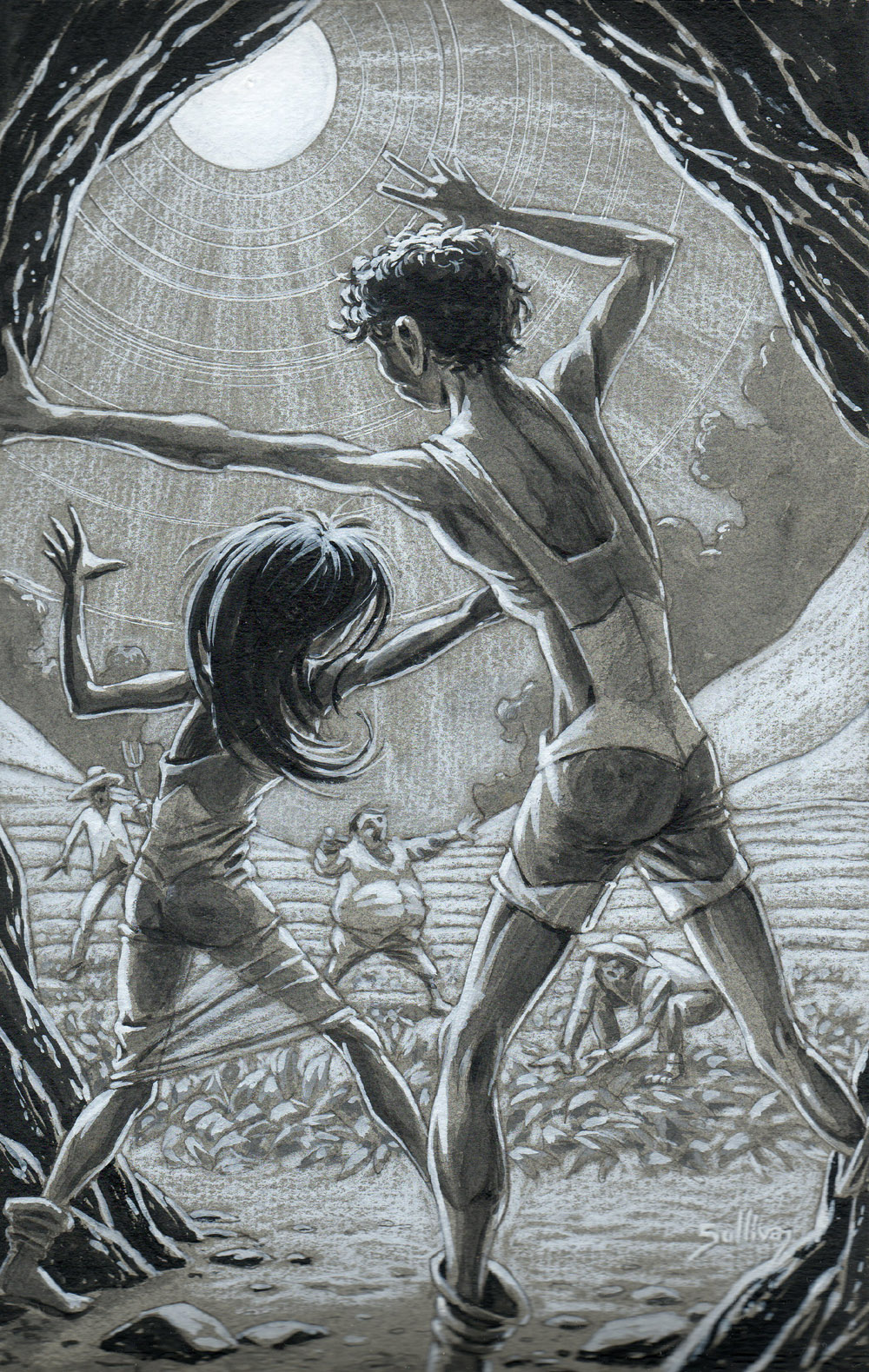
Spain. 1887. Some farmers suddenly spot two strange-looking and oddly-garbed youths emerging from a cave. Unlike Kaspar (Hauser, not the Friendly Ghost) whose skin was white and pale, these kids were green! I particularly like the lighting effect here: I used only white and gray to render the area and figures outside of the cave where the sunlight illuminates everything and provides stark contrast to the cave and figures in the foreground which are delineated with black shading.
Here, the girl is seen spinning a tale of whence she came, a twilight land with no sun, where the bright realm is separated from the darker one by a river. I guess I was having some fun with the looping special effects in this piece.
There's some great action in this image. It's 1967, and we're back in Massachusetts where three high school girls are driving along a lonely road at night when all at once they see four bright lights surrounding a dark rectangular shape in the sky. The car abruptly stalls and the lights go dead until after the object in the sky has flown away. All of the girls were honor students and their account of their experience was taken seriously by local police and citizenry.
Unlike all the other images I've posted from these books, this illustration is not reproduced from the original art.
Jane Hyman, the editor of the series requested that she should keep one original illustration from each book she edited, and this was the one she chose. I shot a halftone photostat of the piece before giving it to her, and this is a scan from that. Looking at the credits, I see my old friend
Jocular John Treworgy listed as the book designer. As mentioned earlier, I worked with John on other projects, many with creative guru
Gary Newton at the design studio he founded. Good times. Later, when John was working for a spiffy publication called The Robb Report, he introduced me to the art editor there who assigned me two double-page spreads to illustrate. These were done in acrylics with some mixed media and I may post images of them before rounding out my trip through the distant pre-digital past wherein I still used brushes and paint.
Thanks again to John and Jane!




 View my profile

